

A Palette Inspired by Orion
Growing up, the only constellation I could always find in the night sky was Orion's Belt. Those three stars were proof that even in the dark, direction exists.
Years ago, when I started honing in on my personal brand, I went with what was aesthetically appropriate. As someone creative, I can be a bit of a maximalist, but professionally, I needed to be seen as someone with restraint. My branding still had personality, but they represented what I thought I needed to be, not what I am. My personal brand was built on perception instead of meaning and reality.
I've spent the last three months redesigning my personal brand—not to start over, but rather, to come home.
This blog post is about my new color palette and how I got there.
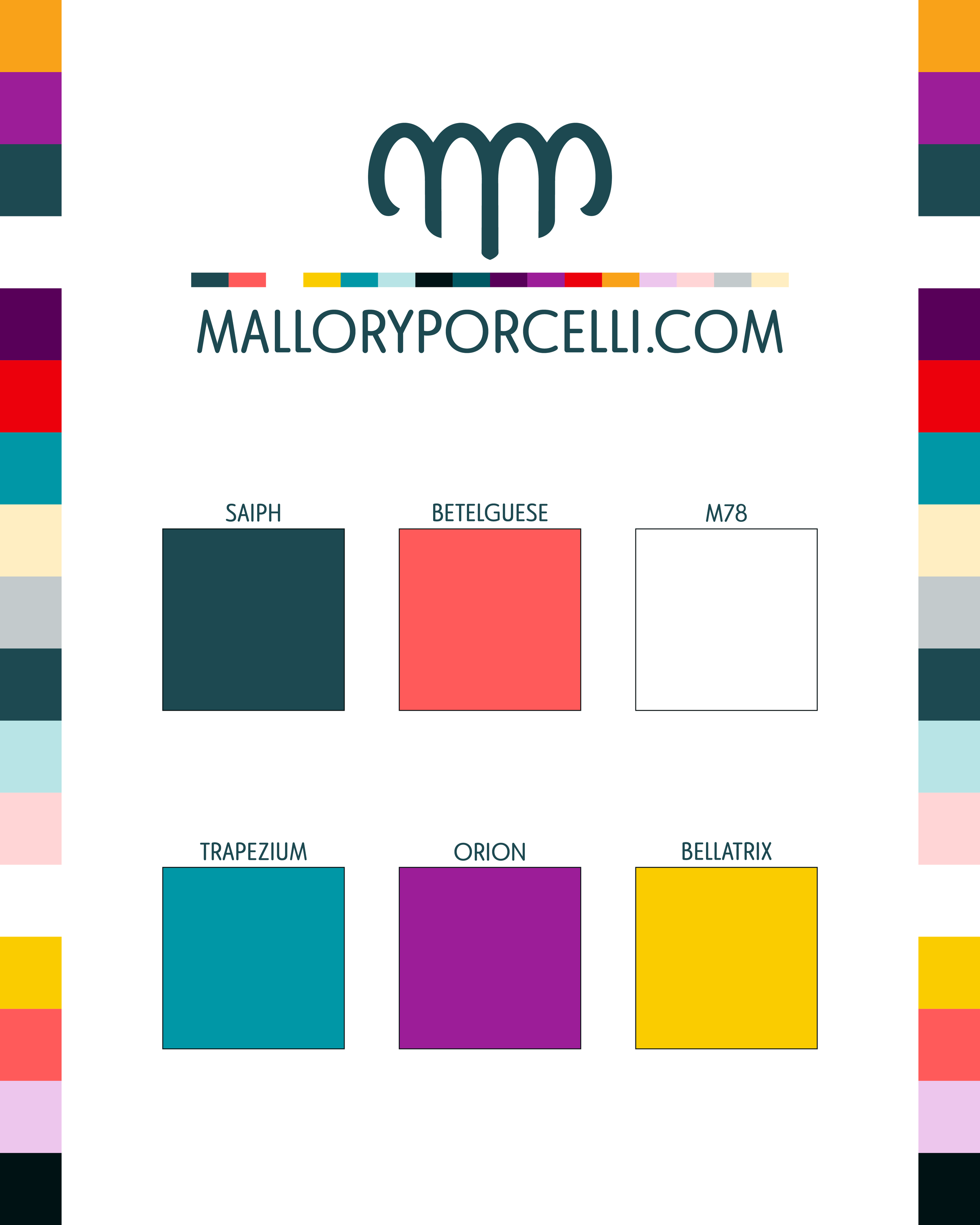
The Orion Palette
I built my new color system around the constellation that’s always guided me — Orion.
Each color is drawn from one of its stars or nebulae, balancing scientific accuracy with personal symbolism.
SAIPH: a deep, grounded teal. It’s calm and steady, like the quiet before something begins—my foundation color — the depth beneath the work.
BETELGEUSE: coral-red, radiant, and human. It represents creative energy, vulnerability, & the kind of warmth you can’t fake.
M78: a reflective white nebula. It’s the pause, the breath, the clarity that allows everything else to make sense.
TRAPEZIUM: a bright teal cluster at Orion’s center. It’s motion and connection — the energy of collaboration and shared creation.
ORION: the violet heart of the nebula, where new stars form. It’s a transformation through tension, beauty built from change.
BELLATRIX: a confident golden hue. It’s light in motion, a reminder that even strength can shine softly.
Why Orion
I didn’t change my colors because I needed something new; I changed them because I finally understood what I wanted them to say.
This palette isn’t about perception anymore; it’s about alignment. It’s both grounded and celestial —a system that feels human and infinite at once.
Orion has always been the constellation I looked for when I needed to reorient myself. Now, it’s built into every corner of my brand: a reminder that direction doesn’t come from control, it comes from connection.
And that, I think, is what personal branding is really about...not just how others see you, but how clearly you can see yourself.
Mallory Porcelli: Orion Color System